
NASA: The Land Temperature Bell Curve Heat Up (1950-2020)
When the bell curve becomes shorter, one can see more data trending toward the right, revealing hotter days.

NASA: This visualization shows how the distribution of land temperature anomalies has varied over time. As the planet has warmed, we see the peak of the distribution shifting to the right. The distribution of temperatures broadens as well. This broadening is most likely due to differential regional warming rather than increased temperature variability at any given location.
These distributions are calculated from the Goddard Institute of Space Studies GISTEMP surface temperature analysis. Distributions are determined for each year using a kernal density estimator, and we morph between those distributions in the animation.
NASA’s full surface temperature data set – and the complete methodology used to make the temperature calculation – are available at: https://data.giss.nasa.gov/gistemp


Support Earth Climate

About the Author: EARTH CLIMATE

Newsletter
Recent Comments
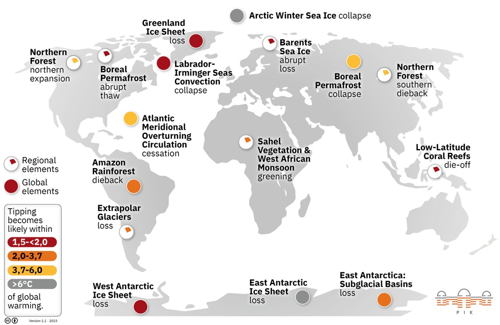
- America’s Climate Free Fall – CounterPunch.org – Theothernews on Climate Free Fall: Scientists Warn of Hidden Economic Crisis, Earth’s Systems Become Dangerously Unstable
- Climate Researcher Levermann: "We Must Understand What Happens After Climate Systems Tip" | EarthClimate on Climate Free Fall: Scientists Warn of Hidden Economic Crisis, Earth’s Systems Become Dangerously Unstable
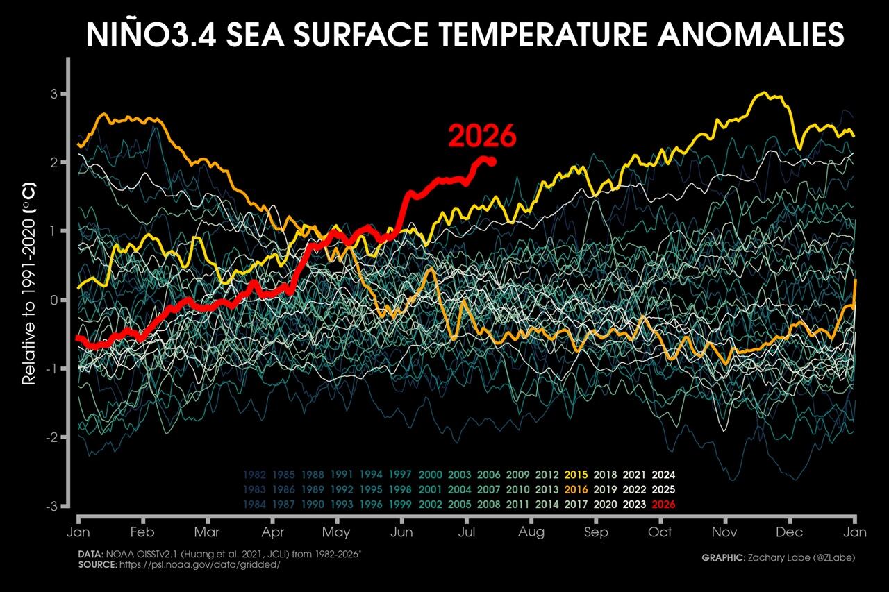
- Extreme Temperature Diary- Saturday July 18th, 2026/Main Topic: The “Super” El Niño of 2026: Why 2027 Will Be a Year That Is Off the Chain Hot – Guy On Climate on The “Super” El Niño of 2026: Why 2027 Will Be the Year the World Watches
Support
We create visually compelling, accessible science content that transforms complex research into engaging videos and articles, helping millions understand the discoveries shaping our world. [Paypal | Patreon]